Citilink
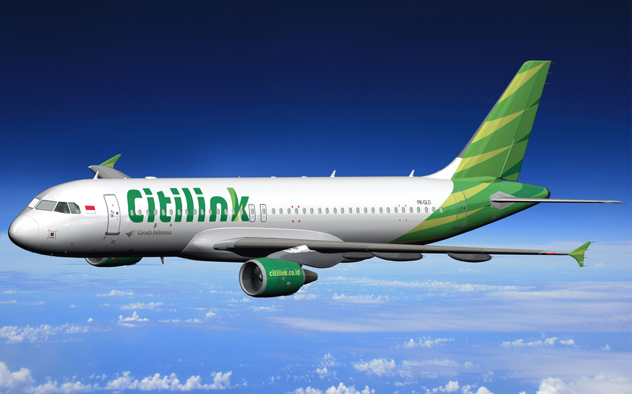
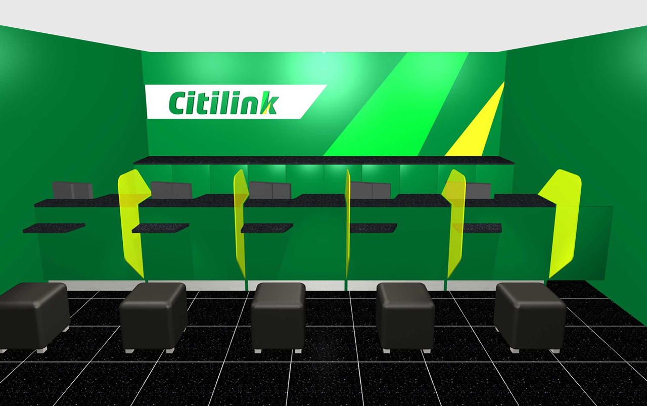
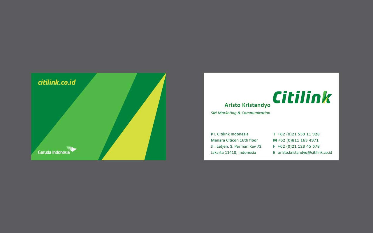
Citilink Indonesia required support for a program aiming at defining a new brand image for a different type of client. The work included interiors, logo, livery, check-in areas and point of sales, business cards, buses & cars livery, stationery, etc.
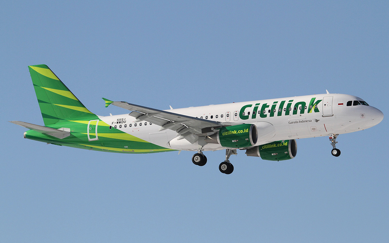
Citilink is linked to Garuda Indonesia, therefore there was a certain degree of interaction with the mother company was needed in order to generate an identity with own character, yet retaining a “family feel”, as highlighted by the tail design.
Development of the new logo, choice of corporate colors and new livery took place in parallel. The target was to define a younger, dynamic, modern and more informal look, yet with some connection to Garuda. This was achieved by adopting fresh and quite saturated tones of green, as well as by using a sans serif and very clean typeface for the logo itself.
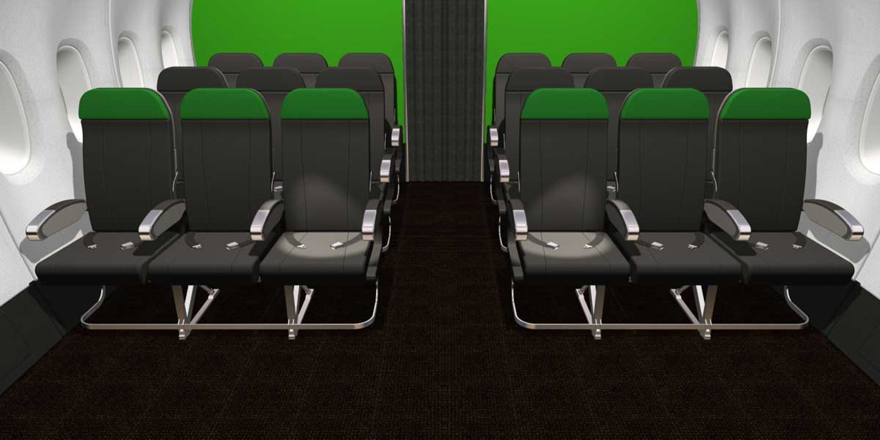
Simplicity & freshness was the key tone provided as requirement for the interior design of the A320s cabin. Dealing with low-cost carrier type of service, practicality, maintenance and costs had to be strictly considered. Different options were presented for leather, textiles, carpet, non textile flooring and wall covers.
Image Credits: ZERO G DESIGN, XFWspot